
|
|
|
|
Boating Center - How charts are made
How are flat charts and maps made for our round planet? Sailors need accurate charts to find their way around the seas. The trouble is, nobody can make a perfect chart because the earth is a large ball and charts are drawn on paper, which is flat. You need to know a few things before you can understand how this problem has been tackled, so here goes! |
|
 |
|
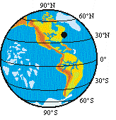
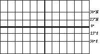
More circles are drawn, parallel to the equator, called parallels of latitude. The latitude of any place on the globe is its distance north or south of the equator, measured in degrees, from 0º at the equator to 90ºN at the north pole and 90ºS at the south pole. Places near the equator are in "low latitudes", near the poles are "high latitudes".
The latitude of New York is just over 41ºN, which puts it in the "mid latitudes".
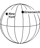
Lines drawn on the globe from the north to the south pole are called meridians of longitude.
The distance east or west of any place on the globe, measured from the meridian through Greenwich in England, is called the longitude of that place. Like latitude, longitude is measured in degrees.
The longitude of New York is 74ºW.
On the other side of the globe, opposite the Greenwich meridian, and just west of Alaska, is the meridian that is both 180ºE and 180ºW. The 180º meridian is called the International Date Line because that is where each new day starts.
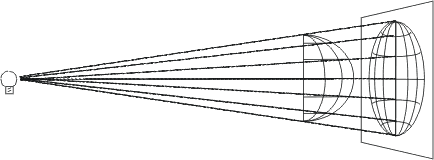
Now we can look at how the round earth is charted on flat paper. The different ways of doing it are called projections, because they start from the idea of shining a light through part of a see-through globe, so that the shadows of the parallels, meridians and the outlines of countries make a chart on a screen.
Countries and seas near the center of the chart will be roughly the right shape, so distances and directions can be measured accurately, but nearer the edges shapes will be all wrong and the chart will be useless for navigation. If countries are fairly near the equator, we can put them at the center of the chart by turning the globe round, but for places farther north and south this won’t work.
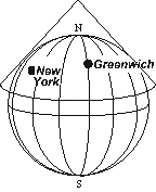
To make charts of places in the latitudes of the USA or Europe, we imagine a cone of paper sitting over the north pole, and a light shining from inside the globe. When the cone is cut up one side and spread out flat the meridians will be straight lines and the parallels will be circles.
Countries close to where the cone touches the globe are roughly the right shape, and charts of fairly small areas can be used for navigation. For places nearer the pole, a flatter cone is used, and for areas very close to the pole, a flat sheet touching the pole.
In atlases, maps of the whole world often use Mercator’s projection. A sheet of paper is wrapped like a cylinder round the globe, touching the equator all round. The meridians are drawn as lines that stay the same distance apart all the way up and down. On the globe, of course, they get closer towards the poles. This means that on Mercator’s projection, countries nearer the pole are stretched sideways, in an east-west direction.
To keep their shapes right on Mercator’s projection, these countries are also stretched in the north-south direction by moving the parallels of latitude farther apart as they get nearer the poles. The trouble is, this makes countries near the poles so much larger in all directions that Greenland looks bigger than the USA, when in fact it has only about the same area as Mexico.
Now let’s look at some voyages a ship might make. (You really need a globe here, to check what I say.) You also need to know that distances at sea are measured in nautical miles, not the 1760-yard mile that’s used on land. There are 60 nautical miles in one degree of latitude, measured north-south along any meridian of longitude. There are also 60 nautical miles in one degree of longitude measured east-west along the equator, but you mustn’t measure along any other parallel of latitude, as the parallels get shorter as you move north or south away from the equator.
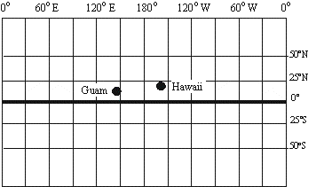
First, let’s go from the island of Guam in the Marianas, to Hawaii. No need to take your passport - they both belong to the USA! If you can find a Mercator map in your atlas, measure the length of the trip with a ruler. (If you want to be more like a navigator, use a pair of dividers or compasses instead of a ruler.)
If you can’t find a Mercator map that has the Pacific Ocean in one piece, any map that does will be almost the same, as Guam and Hawaii are in fairly low latitudes.
Lay the ruler or dividers along the equator and see how many degrees it is - about 59º. Multiply the degrees by 60 and you get the distance - 3,540.
Whichever map you use, the meridians are just a little closer together around the latitudes of Guam and Hawaii than they are at the equator, and so the distance is really a bit less - 3,363 nautical miles.
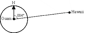
Using a protractor, you can tell what course the ship has to steer from Guam to Hawaii. (Never mind about any islands that might be in the way!) It’s 84º from north - or "zero eight four":
It’s a good idea to check the distance and course on a globe of the world if you can find one. You’ll need one to check what I’m going to say next, anyway.
Now let’s look at a voyage in higher latitudes - from Norfolk, Virginia to Plymouth in England. On a Mercator map, the distance is equal to about 75º measured along the equator. This means 75 x 60 = 4,500 nautical miles. Using a protractor again, the course is 076º.
Now on the globe, measure from Norfolk to Plymouth using a piece of string. Lay it along the equator, and you find that the distance is 52º, or 3120 nautical miles! The Mercator measurement was way out.
You’ll also see that the piece of string crosses the meridians of longitude at different angles on the way from Norfolk to Plymouth. This means the ship has to change course as she goes along, from about 050º at the start, to 104º as she approaches the English Channel.
So the Mercator chart gave wildly wrong answers for both course and distance. This is because we are looking at a voyage thousands of miles long. The Mercator projection can be used in the latitudes of Norfolk and Plymouth, but only for charts of small areas - I’ve got one showing about 30 miles of the coast of France. But for charts covering larger distances in those latitudes, a conical projection is usually used.
So to sum up - near the equator, Mercator charts can always be used.
In the middle latitudes of the USA and Europe, they can be used for charts of small areas, but conical projections are usually used for large areas.
In polar regions, the Mercator projection is really no use at all, and conical projections are always used.